Tuesday, August 9, 2011

Zip-adedoda Seating

We demo many chairs at Interior Image. We sit in all of them, play with their mechanisms, judge their quality, critique their aesthetics and once in awhile we even break them (better us than you). Sometimes the options begin to take over the office and sometimes a chair stands out amongst the group.


The guest chair with the blue seat above - caught my attention.
Meet the Zip chair from All Seating.


This week I am sitting in the task chair as well.


If you would like to add a little Zip to your office, call us.

Tuesday, July 26, 2011

Private Office Desking

A client recently asked for something different - something sleek and updated. He is an executive, but he isn't stuffy or traditional. He's progressive, innovated and optimistic. To create a space that reflected his style, I proposed Watson Desking and the fit was just right.
 We used a dark walnut wood with champagne metal accents.  

 Easy to configure and with many storage options - the possibilities are endless. The ability to create a modern vibe with an open feel, that includes ample storage, is not a challenge with Watson.

I cannot wait for the install in early September.

Tuesday, July 12, 2011

Post Neocon - Textiles

loved the display / fabrics / bags


mix of three different textures is just right

impressive creation using commerical fabric

Post Neocon - Carpet

The more colorful - the more eye catching this year. 


Post Neocon 2011 - Furniture

simple + comfort = high style

bold graphic + polish chrome = eye catching

acrylic screen + curves = center spotlight

veneer + hardware = too pretty to clutter

high back + purple = seating for royalty

whimsy + function = working picnic

color blocks + endless possibilities = furniture fun

clever + form fitting = functional office


low + storage = open office dream


curve + wrap = sassy seats

Friday, June 17, 2011

Talking Tile

I have had the pleasure of talking a lot about tile these days. If you have visited a tile showroom lately, than you know that there are more options out there than ever. From the glamorous mock-ups at Ann Sacks to the shelves at Lowe's, there are great looking tiles in every budget, style, shape and color.

For many people there are rules to follow (busy granite = solid color tile) but most often I find people willing me to "bend" the rules and mix it up for them. The only downside to having many fabulous options is trying to fit them all into a single scheme / room / house...this is the part that requires creativity and self control.

Tile is also viewed as a commitment, so the greatest challenge is finding the perfect timeless tile, that shows your personality today. So if we can't be sure that we will still love (insert your favorite color) what else can you do to show off your tile? The answer is pattern. Below are some examples of creative tile layouts iIhave used recently. Enjoy!

The original tile pattern I had for this bathroom, did not line up with the millwork. I wanted the tile backspash at the counter to continue all the way around the room, uninterrupted. This meant finding the exact layout to avoid the window trim, outlets and light switches. Luckily between the size variations and the option to cut up the glass mosaics as needed, we were able to create this layout. Using the grout spacers we locked it down to the 1/8 inch and it was a success.


I like this example of using three materials; glass, stone and porcelain. Even though all the tiles are the same color, the textures and pattern really bring this design to life.


This shower has many elements and pattern galore, but still gives off a tranquil vibe. Large porcelain rectangles are used vertically and horizontally. Glass mosaics are used in the shower, while larger glass tiles of each color, from the Mosaic, are used outside the shower. Mixed up within the glass Mosaic are nautical metal accents. This was one of those spaces where the client had lots of ideas and was hopeful about using all of them...I think we did and it works.


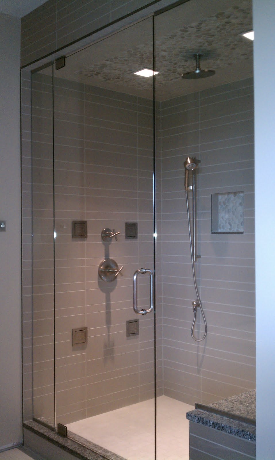
This might be one of my most favorite showers ever. The tile itself is a simple, solid taupe ceramic. But what makes it amazing, is the dramatic rectangular shape. Stacked straight, but using two sizes, the simplicity is sleek. Using rocks on the ceiling and in the niche, gives a back to nature feel. The granite seat ties this stand alone shower back to the tub and vanity.


photo via bloy.net


I wanted to show this as a good example of using a little - to get a lot. This basic white, ceramic subway tile is accented perfectly with just a splash of glass. The glass adds a lot to the look but not to the budget.

Tuesday, May 24, 2011

It's In The Details - Creative Decals

Always looking for a way to bring creativity and personality into the workplace - I was so excited to find these vinyl decals for our lifelines, I mean laptops. Which one fits you best?

The Coffee Drinker, sold here

The Music Lover, sold here
The Kid at Heart, sold here
The Thinker, sold here
{discovered at agaagg}

Tuesday, May 3, 2011

Ballet Inspired Interiors

Lately I have ballet on my mind. Sprinkling what you love into your interiors is always a good idea. Here are some ballet inspired spaces.


"All are welcome to meet Lenore Gimpert on Friday, May 13 between 3 pm and 8 pm during the opening reception of The TUTU Series, a special showing running through June 3, 2011 at TRA Art Group, Suite 15 (MDC). Enjoy hors d’oeuvres and engaging conversation with Lenore while browsing her stunning artwork."


This tutu inspired color scheme works perfectly with the Pantone Color of the year 2011 - Honeysuckle (18-2120).  Per Pantone, "Honeysuckle emboldens us to face everyday troubles with verve and vigor. A dynamic reddish pink, Honeysuckle is encouraging and uplifting. It elevates our psyche beyond escape, instilling the confidence, courage and spirit to meet the exhaustive challenges that have become part of everyday life." Sounds like honeysuckle and ballet have a lot in common.
photo from annesage.com

Wednesday, April 27, 2011

Take Aways - Rust Belt Artist Belt Conference

"Rust Belt to Artist Belt III took place on April 6th and 7th, 2011, at the A. Alfred Taubman Center, in the delightful Rust Belt City of Detroit, Michigan. We learned a lot from each other, and had a good time talking about the role of the arts in Detroit and other post-industrial cities." http://www.rustbelttoartistbelt.com/


I came away from this conference with many ideas for myself, my business, my church, my ptc, my community and our beloved Detroit. The keynote speakers, Peter Kageyama and Josh Linkner delivered fresh ideas and ways for positive change. Below I am sharing my 'take aways', but there are 8 pages, so I will also provide a quick summary.

Embrace being the underdog.
Do great work and be proud.
The one who tells the best story - wins.
Promote yourself, your city and what you support.
Become one of the 1% that gets things done.
Playful makes people smile.
Stop going to "work". Go to "play".
Commit to your city's soul.

{please forgive penmanship, spelling, doodles and spills}

Tuesday, April 26, 2011

Candy Inspired Interiors


Peacock Lollipop Holder by Jonathon Adler, $98

Peacock (check), candy (check), stylish enough to display at home or work (check) - this item is on my wish list. It also got me thinking about candy, candy bowls, candy colors, candy stores...candy can be quite an inspiration for interior design.


Unzipped Glass Zipper Bag, $20


I confess, if there is a candy bowl on someones desk, I am tempted. Most often candy is displayed in something that coordinates to the next holiday, but this dish is a conversation piece all year long.


Candy was truly the inspiration for these interiors below, enjoy they are yummy to look and shop at.

M & M Store, Las Vegas - photo info here

Dylan's Candy Bar, New York

MSC Splendida - Caramella Candy Shop, Cruise Ship